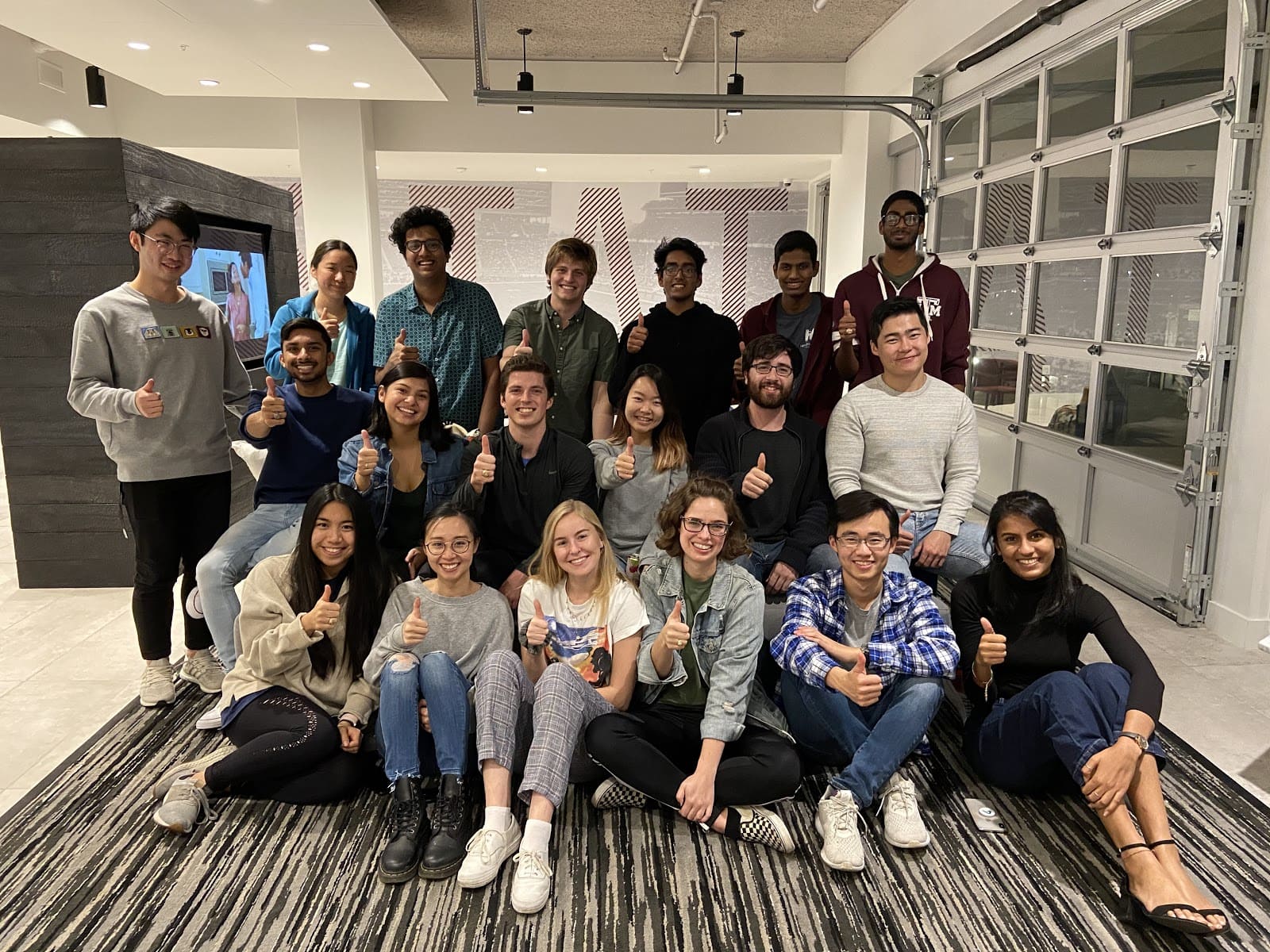
TAMUhack 2020-2021
TAMUhack 2020 was a success. With that done, the seniors graduated and I took on the role of Creative Director. When I joined the team, there were only two members including me on this section of the team. With all the recruiting that has happened, I now lead a team of 3 for all design and marketing purposes.
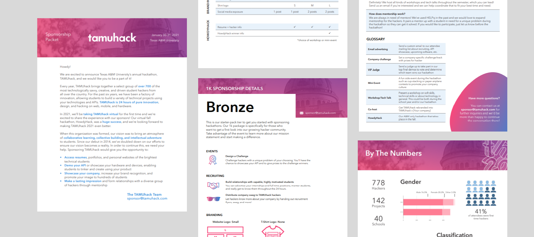
Infographic and Sponsorship Document
A year on from when I joined the team, I worked on an infographic for TAMUhack 2020 which contained similar graphs to last year's with a different theme.
A new task I was now in charge of was the sponsorship document. It was a packet to inform company representatives of our event and options to sponsor. I merged the iconic Academic building with a gradient of the organization's main colors, pink and blue, to create a clear and concise sponsorship packet.
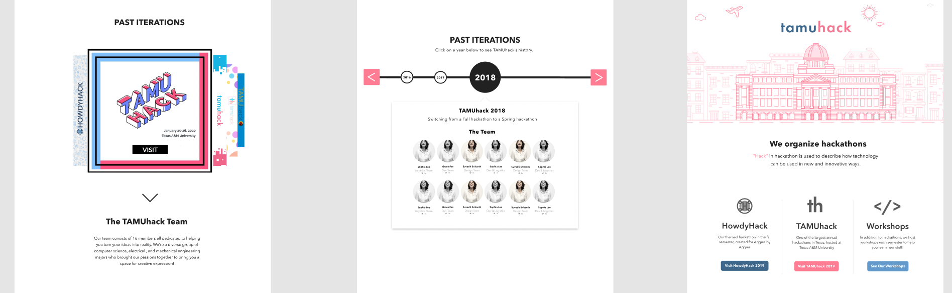
Hub Website Redesign
With the organization now putting up two hackathons, it is no longer sufficient to just have event websites but instead a website that doesn't change as often to serve as a hub for our events. There were some interactions and design issues on our site last year, so our first major task as a design team was to make those changes.
The illustrations on the website are great, but black on pink had not been the most effective colors for both readability and aesthetics. The main change I made was to convert the graphic to pink, and the removed the wave feature in the middle of the page. This shortened the page by nearly half while keeping the same content.
For this site design, I asked all members of the team to create a version of the website after syncing up together. With this method, we came up with some great ideas and found a way to merge both the past events section and the directors section together. The final version of the hub website was much shorter in length while containing more content than the previous year.
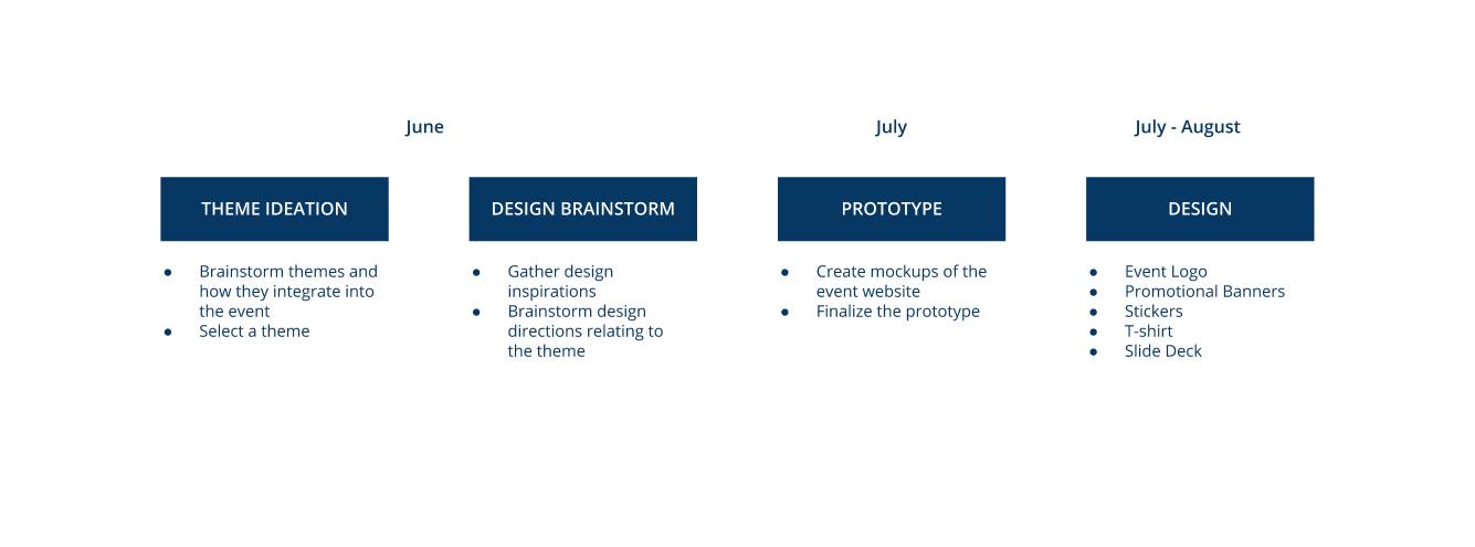
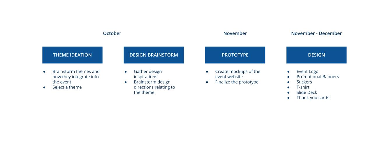
HowdyHack 2020
To design this hackathon, we followed the timeline below. The timeline ensured that we would have everything done by the start of registration for the event.
After brainstorming with the entire team, we decided on a Spy + Film Noir
theme for the event. We wanted HowdyHack's theme to be prominent in the
event, and a main aspect of virtual events is the website. I led the design
team to design and settle on a design for the spy-themed website.
Since everyone has a different design process, I proposed for the team to
agree upon a set of inspiration materials and design their own version of
the website. This was a slow process, since every member of the team would
need to design a full website. However, this ensures that everyone can
contribute ideas and we can combine our takes to come up with a better
finalised design.
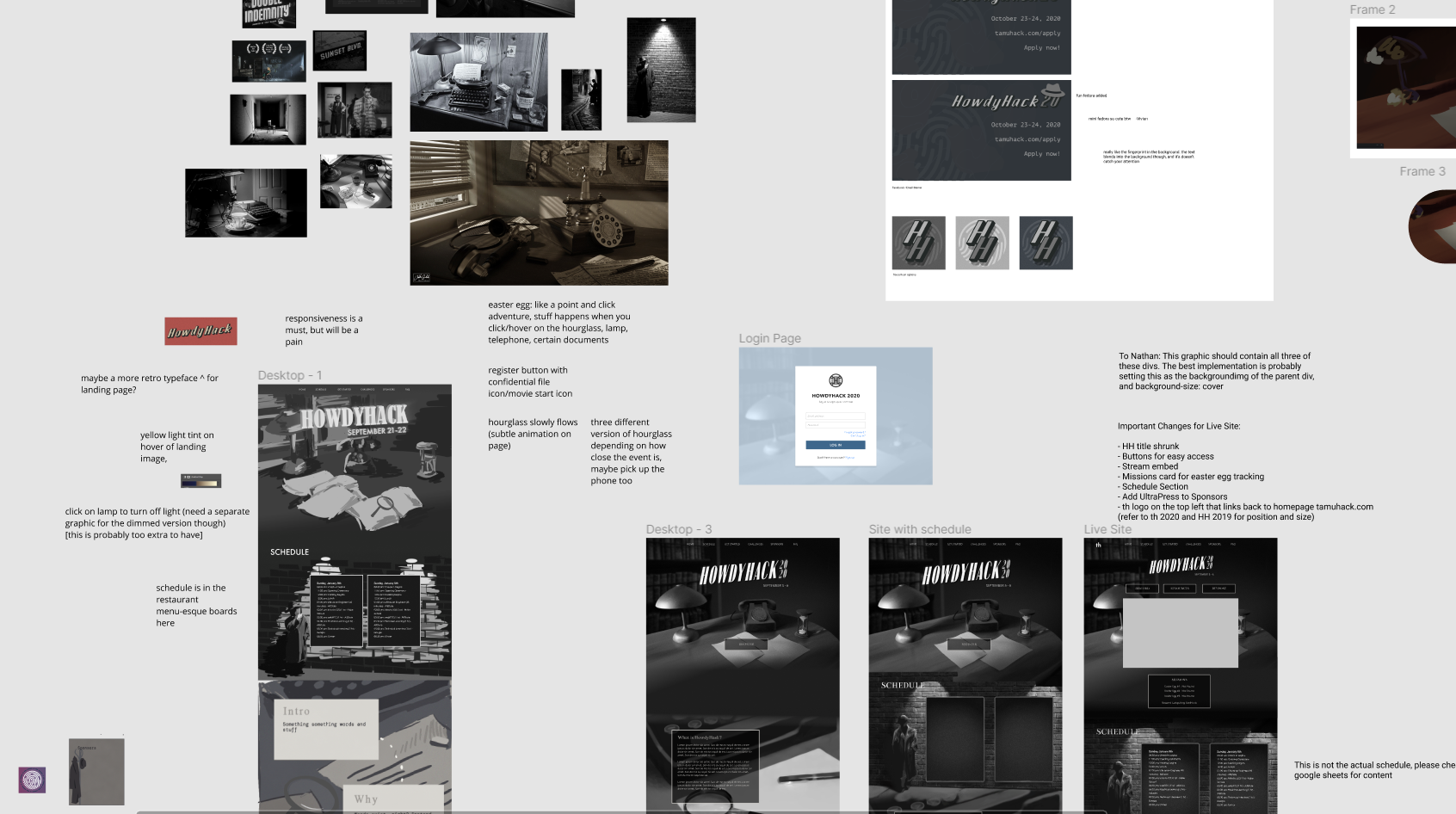
A challenge we ran into was decisions getting delayed due to the pandemic.
It was more difficult to design materials without knowing how they would be
distributed or shown to participants. Among the designs the team worked on,
I helped give advice and feedback for the event stickers, logo, and banner.
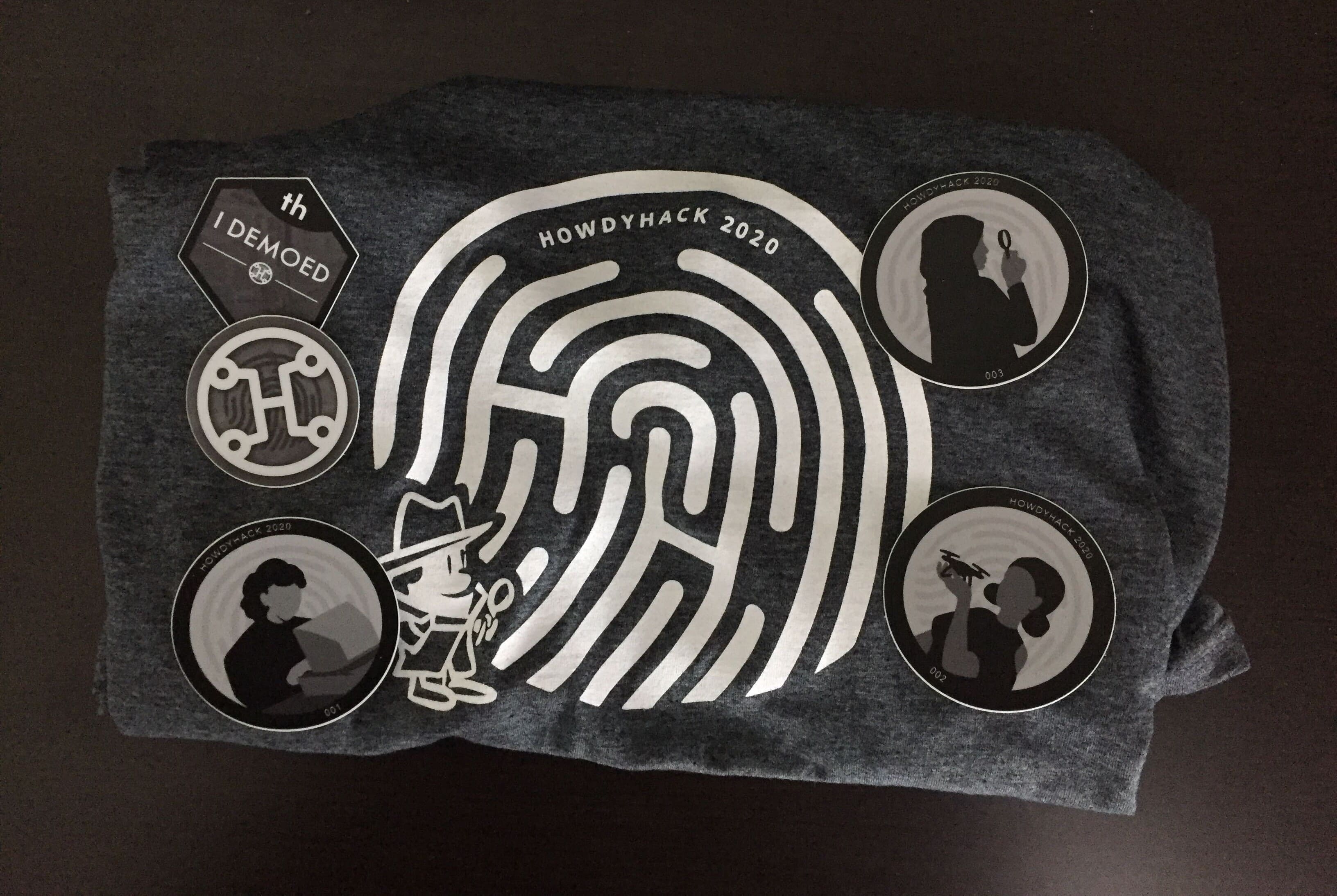
I took on the task of designing the event t-shirt. I wanted to make use of
older cartoon styles for the film noir theme while keeping true to the spy
theme. I settled on using a fingerprint and drawing a cartoon detective. I
originally wanted to turn the outlines of the fingerprint into a maze, but
that added a little too much chaos and deformed the fingerprint. I ended up
integrating the HowdyHack acronym (HH) into the graphic.
Our first virtual event turned out to be a great success. We had a bunch of mini-events that really helped engagement, my favorite being a virtual Capture the Flag designed by me and a couple members of the team. Now, onto the main event...
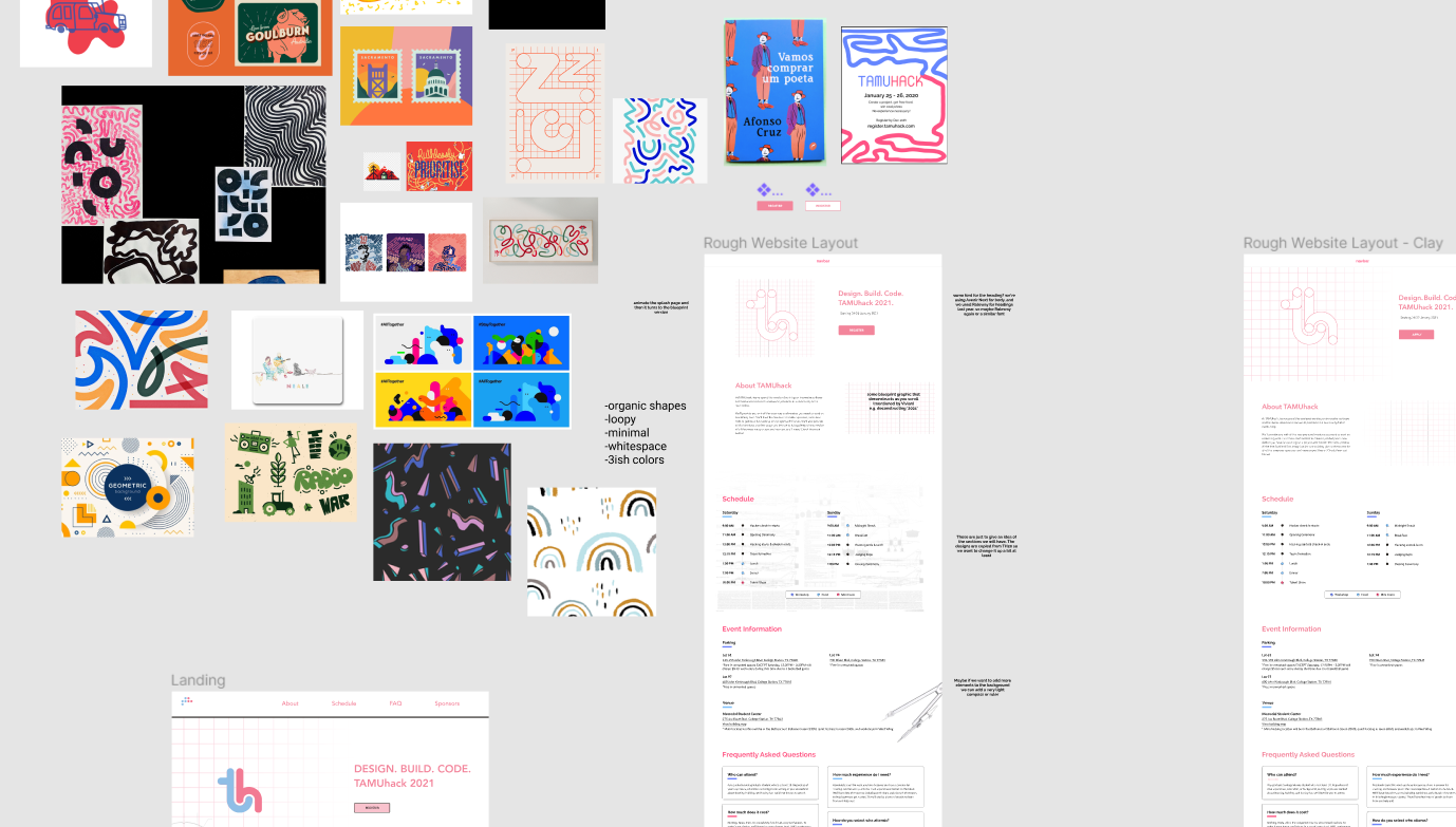
TAMUhack 2021
We followed the timeline below designing for TAMUhack 2021. Our team made use of many previous methods that were successful in organizing the previous event. Having decided on a virtual event again, a thing I thought would be cool was an emphasis on animation, since the website would be the focal point of the event.
I became interested in logo animations, coming across a few creative ideas and designs. For TAMUhack, I thought about keeping the 'th' as we always did, and doing something interesting with animation. Braille was the first thing that came into mind while thinking about the initial state of the logo. The dots of the braille logo would move around and drawing lines, resulting in 'th'.
Building upon this animation, we designed the event website and promotional materials with the same approach as HowdyHack 2020. We leaned towards a blueprint style while designing.